Pas Mal Restaurant
Welcome to Pas Mal. For this fictional project, I did branding for a French restaurant and transformed it into a trendy, highly Instagrammable experience.
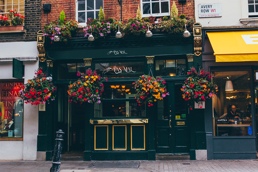
Pas Mal is a deeply satirical French restaurant whose primary aim is to ridicule the perception that Canadian and American’s have of Parisian people being inherently fancy and cool. In French, “Pas Mal” means “Not Bad.” The irony is that the food is very bad. You do not come to Pas Mal for the food; you come for the experience. Prepare to be disrespected in this abhorrently “laissez-faire” establishment whose aim is to see just how far they can push their luck before the air of chicness and cool crumbles.
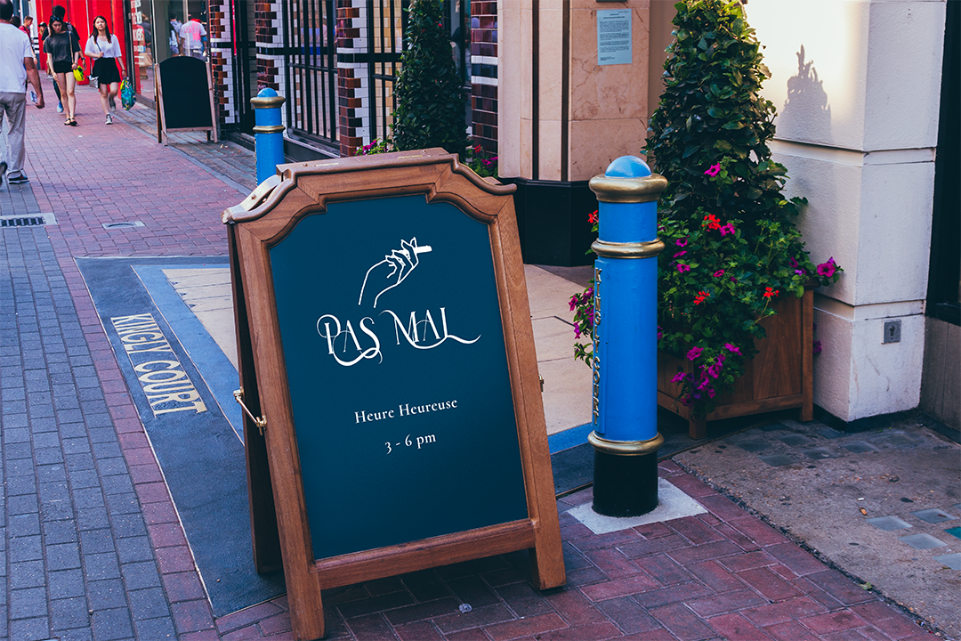
The logo: For the logo, I was intent on capturing the laissez-faire attitude of the restaurant, which is distinct from most of their competitors. I did so by selecting a decorative font that emulates smoke billowing from a cigarette and customizing the font for a more fluid appearance.
The colour palette: As a starting point for the brand colours, I plucked the brand colours from the French flag because it was a way of referencing stereotypical Frenchness in a purely visual manner. I also added a pop of pink for that fun, youthful element of the brand.
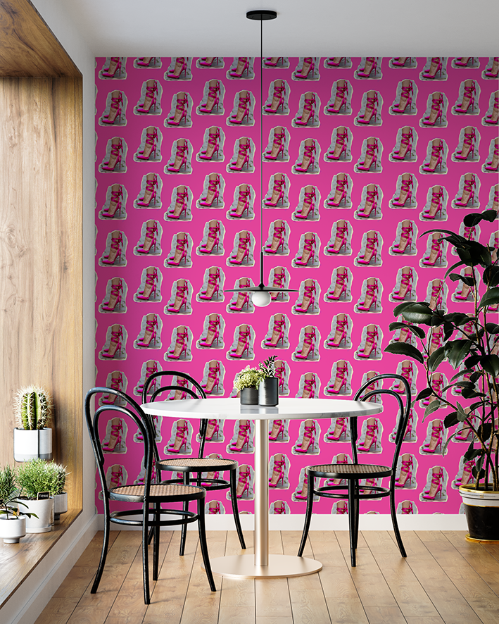
The wallpaper: Every restaurant needs some wallpaper! And, in this case, I decided to lean in to Pas Mal’s quirky, humorous and “out there'“ essence. A collage aesthetic was the right choice for this brand because it emotes that “I didn’t try to hard” attitude—which, is Pas Mal to a tea! Look closely in these illustrations and you will not only see the ripped paper but also the tape marks. Would you be so bold as to paper your restaurant with this show-stopping wallpaper?
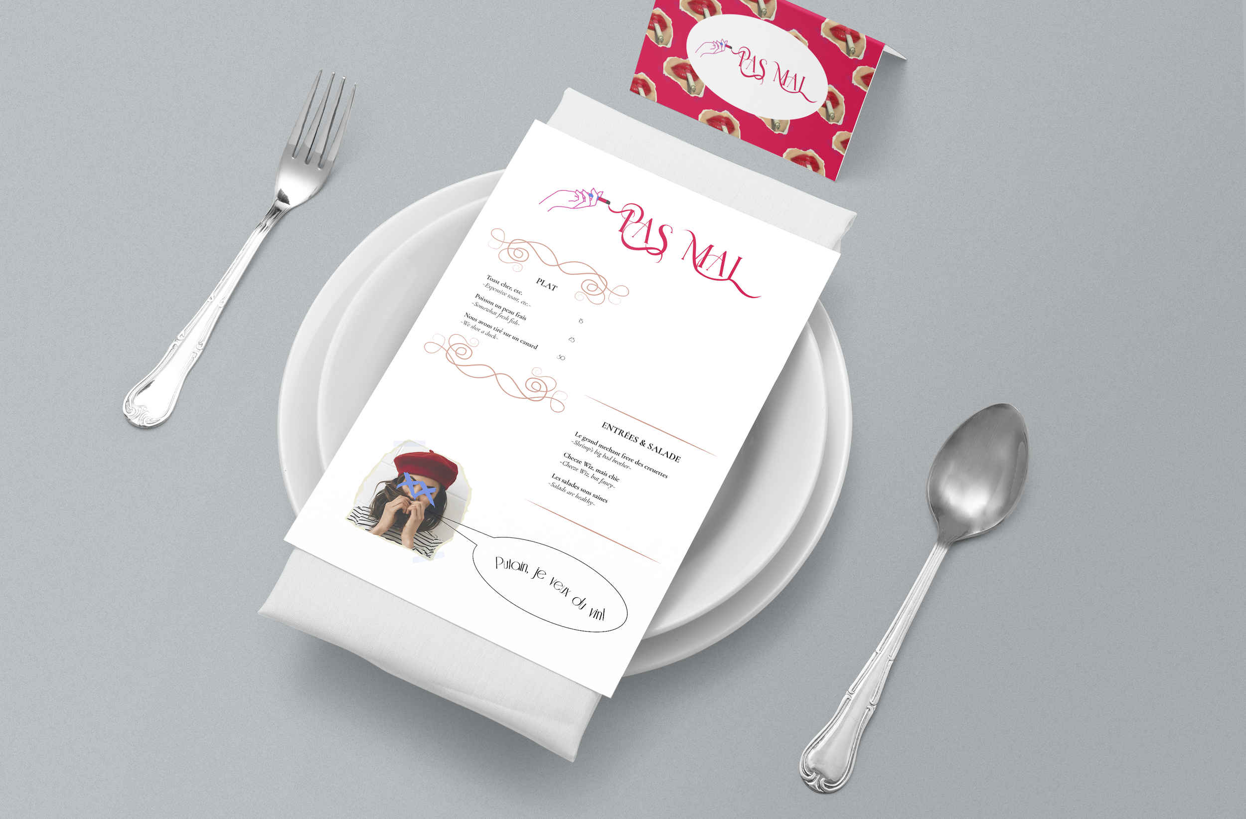
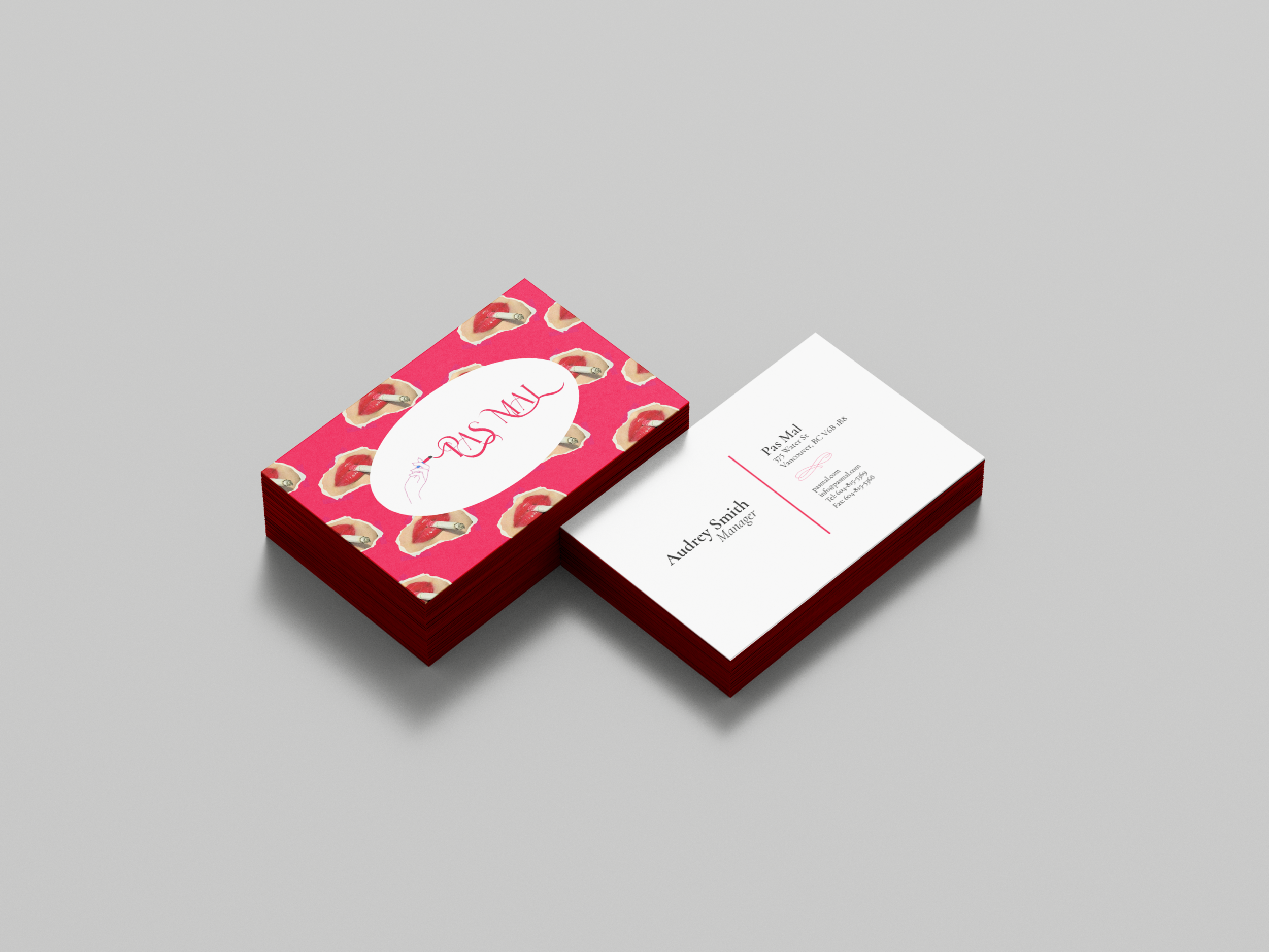
The business card: Even in today’s digital world, business cards are important. In fact, I would argue that they are more important than ever because they provide a personal and professional touch when interacting with a client face-to-face. Due to Pas Mal’s vibrant persona as a brand, I went with a memorable design that will grab any persons’ attention when riffling through their wallet.
The menu: And finally… the menu! Who else missed physical menus during the QR-code menu phase of the last two years? I sure did. Pas Mal is definitely a brand that knows how to laugh at itself and this menu is no exception. Notice the humorous item listings paired with the venetian-style decorations. What may look like an elegant design is certainly not upon closer inspection.